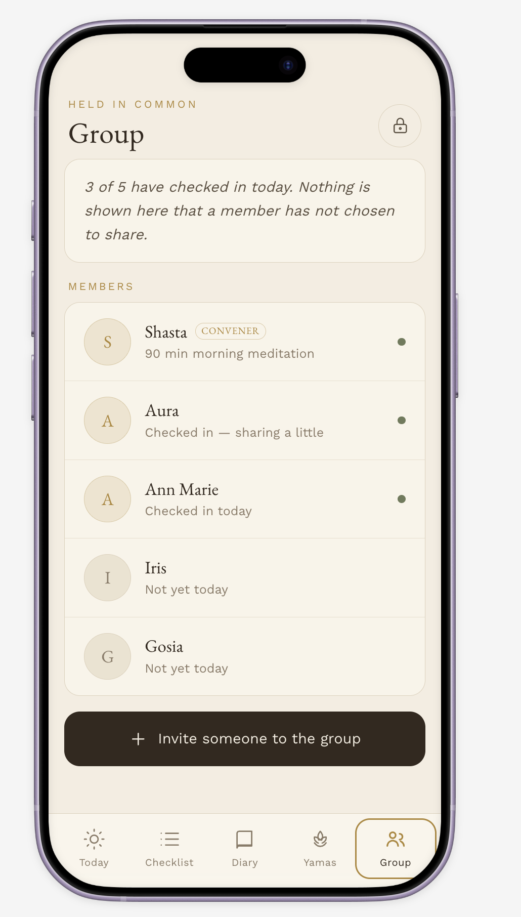
Sangha
A Private Check-In App for a Devotional Practice Group
Role: Creator/ Content Strategist / UX Designer
Tools: Figma Make (AI-assisted prototyping)
Type: Mobile app, private beta for a small practice community
The problem
My devotional group had been using HabitShare to track a shared discipline checklist — a detailed, deeply personal practice log covering everything from meditation time to service hours. It broke down in two specific ways:
No real privacy model. Members had no way to control what of their practice was visible to the group versus kept for themselves. For a checklist this personal — touching on diet, sleep, intimacy, and inner devotional quality — an all-or-nothing visibility setting isn't a minor UX gap, it's a trust problem.
Generic design. The interface read like any commodity habit tracker — streak counters, badges, bright progress bars — which sat oddly against the actual content: a contemplative daily discipline meant to support quiet, sustained practice.
The brief I set for myself: replace it with something that felt as considered as the practice it was tracking, and that gave every member real, granular control over what they shared.
Constraints that shaped the design
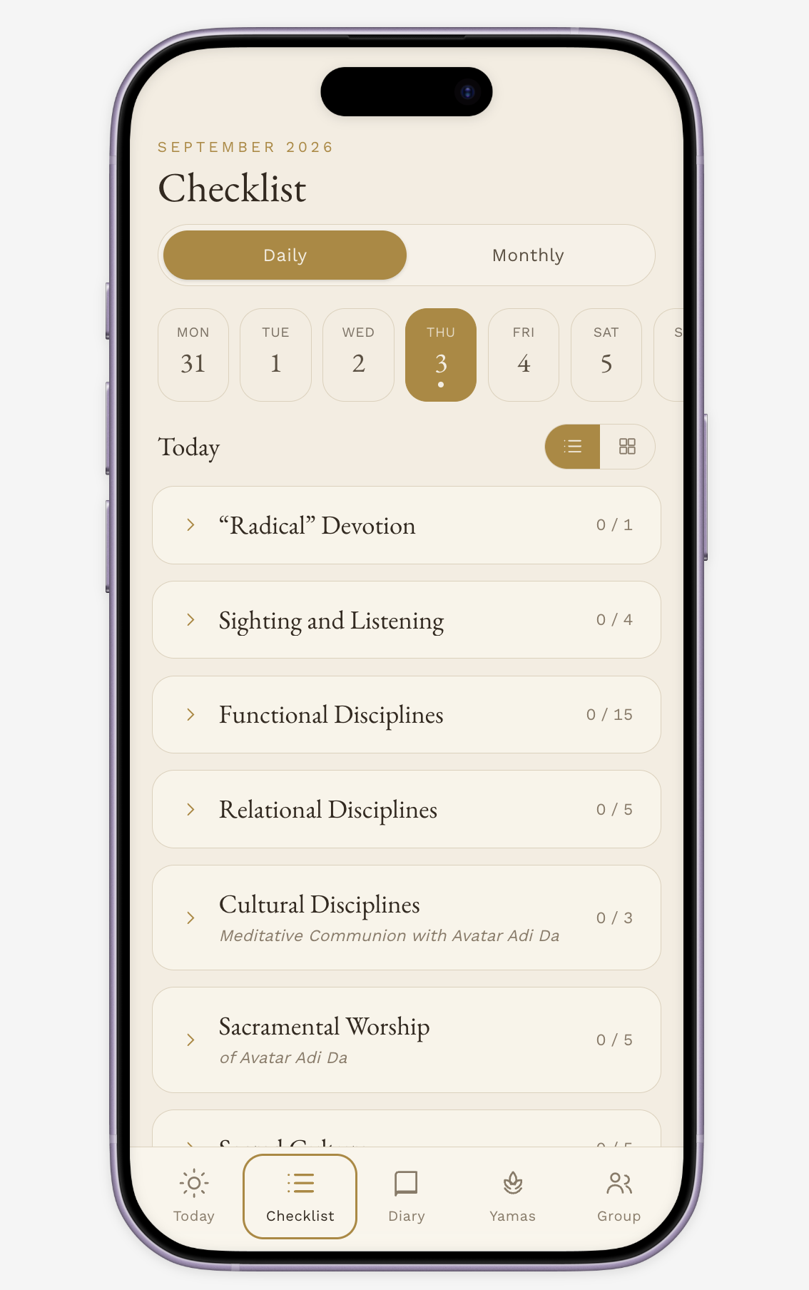
The checklist itself wasn't something I could simplify — it's a fixed, detailed instrument spanning six sections (Radical Devotion, Sighting and Listening, Functional Disciplines, Relational Disciplines, Cultural Disciplines, and monthly Practical Disciplines), with entries in five different formats: 1–3 ratings, plain marks, time entries, percentages, and a three-way selector. The design challenge wasn't reducing the content — it was making a genuinely dense instrument feel calm and usable on a phone.
Key decisions
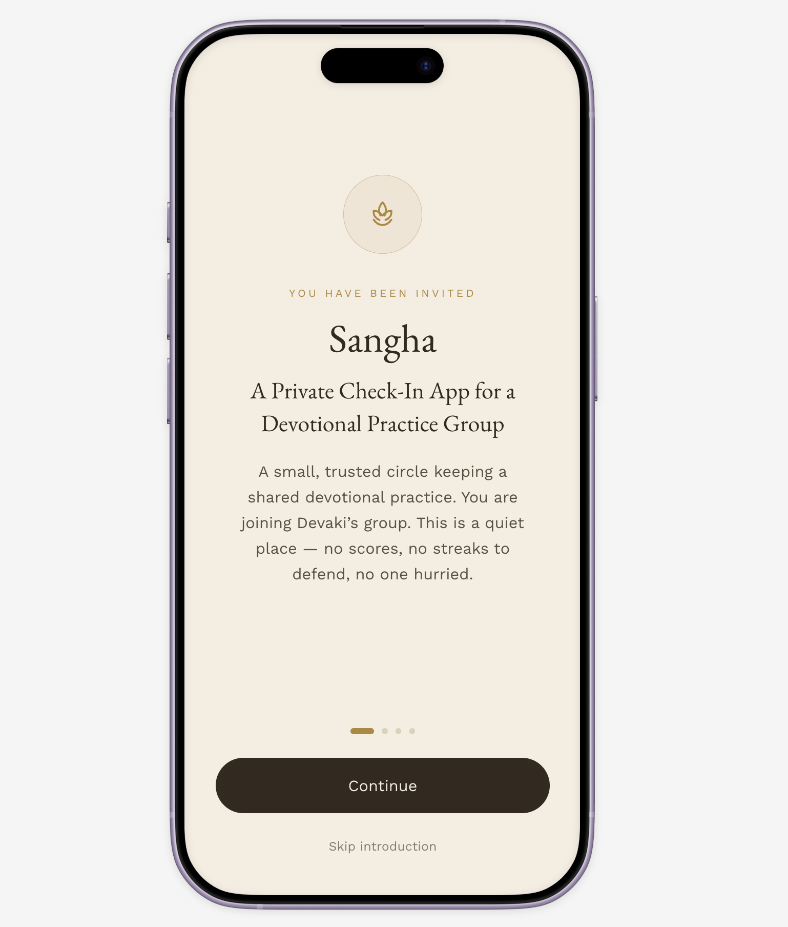
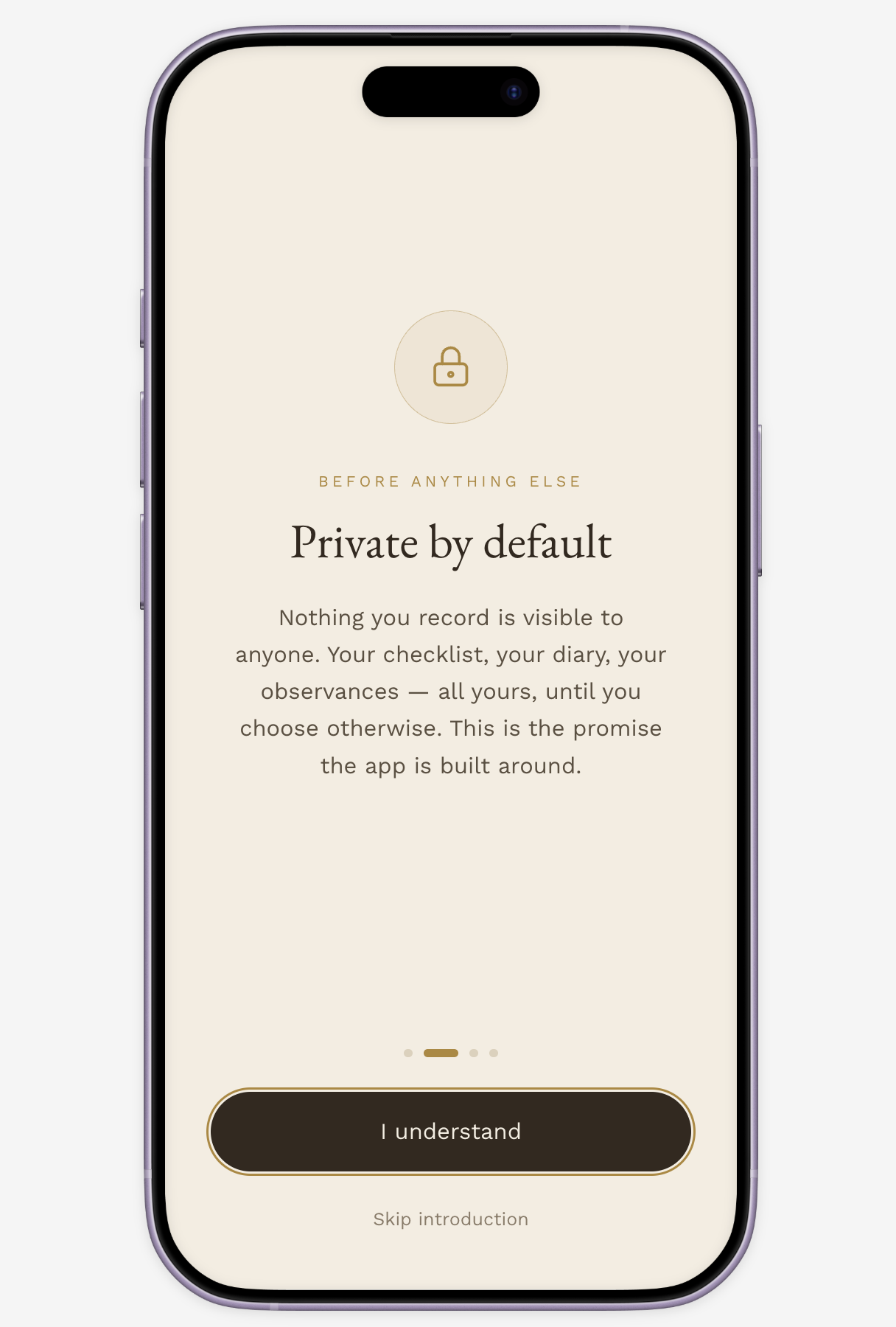
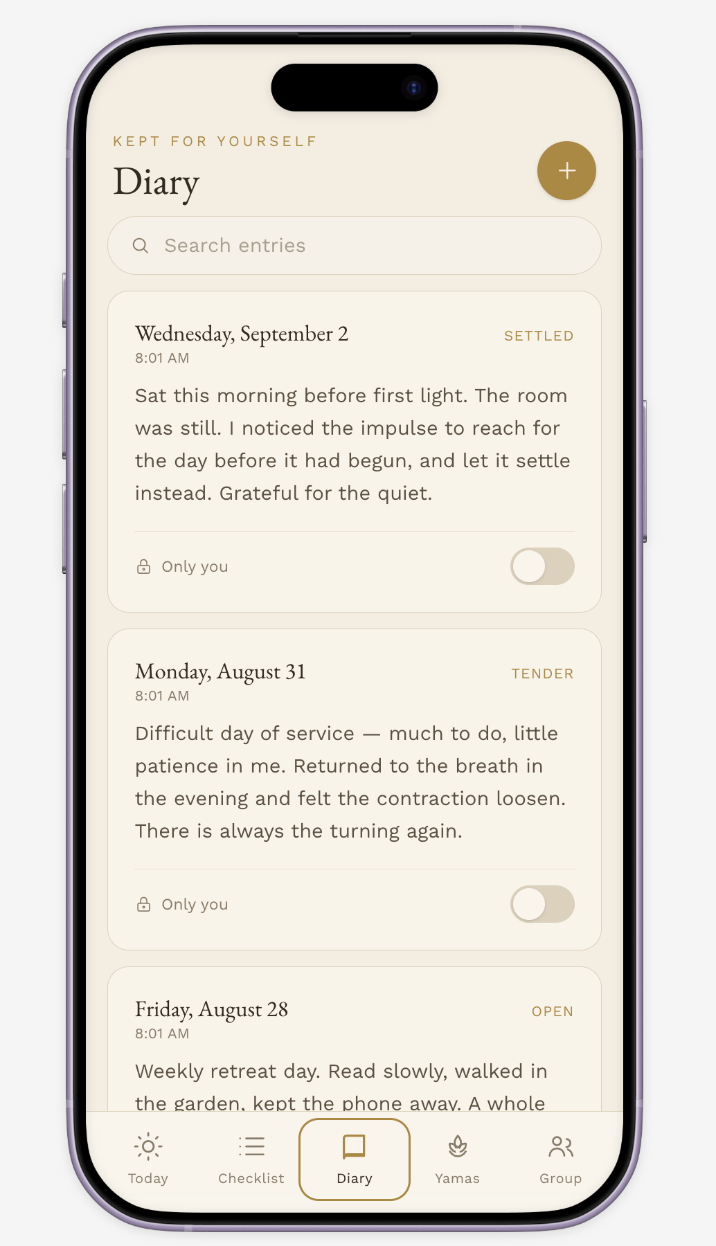
1. Privacy as the core architecture, not a settings afterthought. Every entry is private by default. Sharing is opt-in at the section level — a member might share their Cultural Disciplines with the group while keeping Relational Disciplines and their Diary fully private. The group view itself defaults to soft, encouraging signals (who checked in today) rather than exposing granular detail. This was the single most important requirement, and I treated it as a first-class design constraint rather than a settings screen bolted on at the end.
2. Mobile-first, single-day entry — not a grid crammed onto a phone. My first pass modeled the checklist as a calendar-style grid (items × days of the month), which works on paper and on a desktop screen, but falls apart on mobile. I redesigned the primary interaction around a single scrollable day — a date strip up top, the full checklist for that day below — with the full-month grid demoted to an optional secondary view for anyone who wants the at-a-glance pattern. This is the kind of tradeoff that only shows up once you commit to a real form factor instead of designing "responsive" and hoping it holds up.
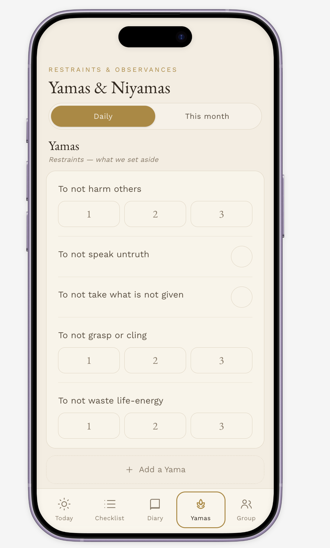
3. A visual language that matches the content. I moved from an initial dark, gold-on-charcoal theme (consistent with other Adidam materials I've designed) to a lighter, warm parchment palette for this specific app — soft cream backgrounds, espresso-brown text, a single muted gold accent, an elegant serif for headings. The goal was an interface that feels like a well-kept paper journal, not a productivity tool. No streak flames, no confetti, no leaderboard language — the microcopy throughout stays quiet and reverent rather than defaulting to generic app-speak ("You're crushing it!").
4. Restructured information architecture. Rather than one long checklist, I split the app into five clear destinations: Today (fast daily entry), Checklist (the full daily/monthly instrument), Diary (private journaling, previously just a row in the checklist), Yamas & Niyamas (its own tracked category, since these vary by member and deserve their own space), and Group (viewing shared practice, sending quiet encouragement, and managing invites). Pulling Diary and Yamas & Niyamas out of the main grid made the checklist itself less overwhelming and gave each kind of content room to work the way it actually needs to.
5. A group, not a database. The invite flow — a shareable link or short code that drops a new member straight into onboarding and the privacy explanation — was built to keep the group feeling like a small trusted circle you're welcomed into, not an account you sign up for. Group visibility, including for whoever manages the roster, stays opt-in for every member; there's no elevated "admin sees everything" role.
Process
I worked prompt-first: writing a detailed design brief (data model, privacy requirements, screen list, tone) rather than designing screen-by-screen, then iterating on the whole system at once as requirements sharpened — first tightening the privacy model, then reworking the entire thing for a true mobile form factor and lighter palette, then adding the Diary, Yamas & Niyamas, and Group/invite structure once it was clear the flat checklist needed to be broken apart. Figma Make let me test full-app coherence quickly at each pass, rather than validating individual screens in isolation.
Outcome
A private beta now live for the group at forum-guitar-75861823.figma.site — replacing a tool that had quietly eroded trust with one built around it.