Authoritative Digital Archive
CONTENT STRATEGY & INFORMATION ARCHITECTURE
Role: Content Strategy · Information Architecture · UX Design Project Type: Subscription-Based Digital Archive — Strategy through High-Fidelity
Prototype Tools: Figma Make · Chat GPT · Google Slides
Full prototype available by request — password protected out of respect for the client.
Authoritative Digital Archive
Complete Works Platform Strategy & Conversational Interface Design
CONTENT STRATEGY & INFORMATION ARCHITECTURE
Role: Content Strategy · Information Architecture · UX Design Project Type: Subscription-Based Digital Archive — Strategy through High-Fidelity
Prototype Tools: Figma Make · Chat GPT · Google Slides
Full prototype available by request — password protected out of respect for the client.
The Project
A 20th-century American spiritual teacher and author left behind a singular, internally coherent body of work — approximately 200–300 items across books, audio recordings, video, essays, and talks, spanning roughly four decades of teaching activity.
The organization stewarding this body of work needed a digital platform that could do something most digital archives aren't designed to do: function as the definitive, authoritative source of truth for the complete works — not just a browsable collection, but a canonical record.
I led the content strategy, information architecture, and UX design across three prototype explorations, and developed the strategic framework that became the foundation for the entire project.
The Strategic Reframe
The first and most important decision wasn't a design decision. It was a naming and framing decision.
The client came in thinking about this as a digital library. I reframed it as a Complete Works Archive — and that single shift changed every downstream decision about IA, navigation, browsing patterns, metadata, and tone.
Here's why it mattered.
A digital library is designed around volume, search, and access. It assumes a large, varied corpus and many kinds of users browsing in many directions. The UX patterns that follow from that framing — prominent search bars, database-style filtering, category browsing — are well-established and generic.
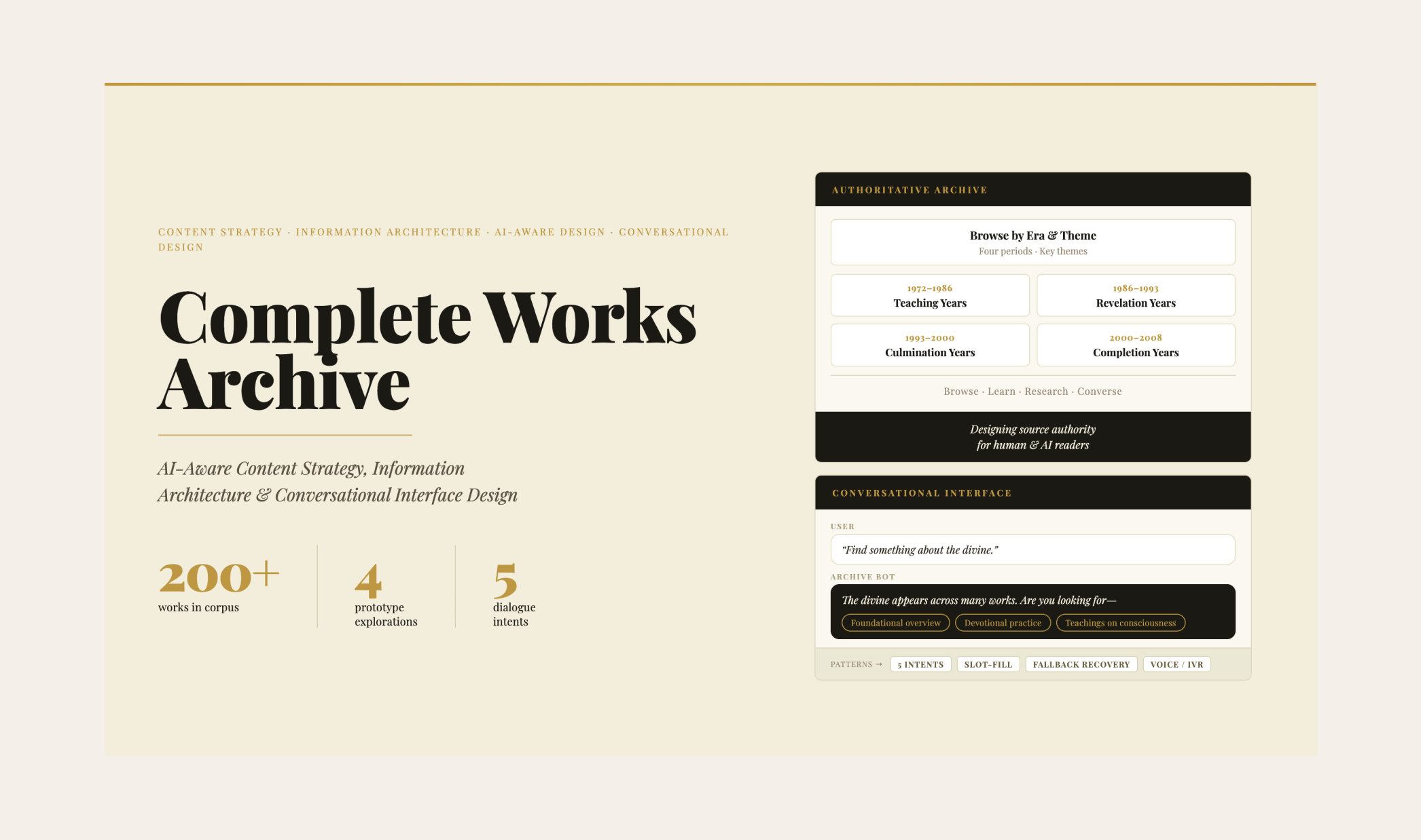
A Complete Works Archive is designed around completeness, sequence, and authority. It assumes a finite, coherent corpus that has internal relationships, chronological development, and a single authorial voice. The UX patterns that follow are fundamentally different: browsing organized by era and theme, canonical work detail pages designed as stable reference anchors, editorial restraint throughout.
The distinction also had a dimension the client hadn't fully considered yet: AI legibility.
Designing for AI as a Content Strategy Problem
AI systems don't encounter content the way human readers do. They infer authority, completeness, and source reliability from structural signals — consistent metadata, stable URLs, clear hierarchy, a single canonical page per work, editorial restraint that avoids competing paraphrased summaries sitting alongside original text.
The client's content was already fragmenting across secondary sites, out-of-context citations, and AI-generated summaries that flattened nuance and misattributed meaning. This is an emerging problem for any organization with a substantial published body of work — and it's a content strategy problem before it's a technical one.
By designing the archive to send strong source-of-truth signals, we weren't just building a better user experience for human readers. We were establishing a canonical reference point that AI systems could recognize and prioritize — shaping how the body of work would be understood and cited as AI mediation of published content continues to accelerate.
I developed a stakeholder document articulating this strategic rationale — why the naming shift mattered, what signals the UX needed to send, and what specific design decisions followed from those signals. That document became the foundation for alignment across the project team.
Three Design Explorations
Rather than designing a single solution, I built three distinct prototypes — each addressing a different entry point into the same body of work.
The first was a threshold experience: a calm, atmospheric homepage designed to slow the user down and signal depth before offering three clear pathways into the archive. Not informational — experiential. The design goal was to establish emotional register before presenting any content.
The second was a biographical timeline: a scrollable, image-led chronological journey through the teacher's life — from early years through decades of teaching activity. Each moment in the timeline was expandable, with cross-links into related teachings and works. The design intent was that a user would finish the timeline feeling like they'd met the person, not just encountered a catalog.
The third was a living library system: the full browse and search architecture for 200+ works organized by era, theme, medium, and collection. The design challenge here was making scale feel navigable without flattening the collection into an undifferentiated data dump. Filter logic, collection groupings, and individual work detail pages all required careful IA decisions about hierarchy and context.
The three prototypes together function as a design argument: different users need different entry points into a complex body of work, and a well-designed archive makes all three available without forcing a single path.
Information Architecture
The IA for the full site covered six primary sections: Browse the Archive · Learn the Teaching · Research Center · The Life · About the Archive · Access / Subscribe.
Key IA decisions included:
Browsing over searching as the primary mode. Search exists but is intentionally secondary — the collection has internal coherence and the IA reflects that rather than flattening it into search results.
One canonical page per work. Every item in the collection has a single stable reference page with consistent metadata — title, date, format, context, and relationship to other works. No duplicates, no competing summaries.
Era and theme as primary organizational axes. Works are organized by the four major periods of teaching activity, and by recurring themes that cut across the chronology — allowing both sequential and thematic exploration.
A Research Center as a distinct section. Separate from casual browsing, the Research Center provides structured tools for scholars and serious students — academic resources, guided reading paths, and contextual framing for the collection as a whole.
Subscription gating that doesn't undermine trust. Free public access to selected works and introductory materials, with clear but non-promotional gating for the full archive.
What This Project Demonstrates
This project sits at an intersection that is increasingly important in content strategy: the convergence of information architecture, editorial integrity, and AI-aware content design.
Most content strategy work is still being done without accounting for how AI systems read and rank content — which means most organizations are losing ground on source authority without realizing it. The strategic reframe I developed here — from library to canonical archive, with specific UX signals designed to establish source-of-truth status — is a framework applicable well beyond this specific project.
It's also a project that required holding complexity at multiple levels simultaneously: a sensitive and specific subject matter, a client with deep domain knowledge, a stakeholder audience that needed the strategic rationale translated into plain language, and a design challenge with no obvious template to follow.
Full prototype available on request · Three Figma Make prototypes · Stakeholder presentation and strategic framework document available alongside