Defining Style and Easing Cognitive Load for Handshake App Users
My goal:
As the UX writer, I needed to edit user-interface (UI) text for the Handshake app for two different types of users. I was most focused on creating a definitive style for Handshake that would make using the app clear and concise. I also aimed to ease the cognitive load that comes with payment and banking software because humans tend to exhibit stress when it comes to money, and errors can easily be made.
Discovery is to Empathize:
User research shared two guiding personas to develop a content style guide around.
Kelly Chan, a 24-year-old tech-savvy freelance web developer, and Tom Stewart, a 62-year-old tech-newbie small business owner. Tom had hired Kelly to redesign his business website.
Freelancer persona “Kelly Chan”
Business Owner persona “Tom Stewart”
Crafting Voice & Tone:
1) Develop empathy and create a user-centric experience
In order to develop a meaningful style for Handshake, the first step was to feel into the possible emotions the users of the app may experience in order to develop empathy and create a user-centric experience.

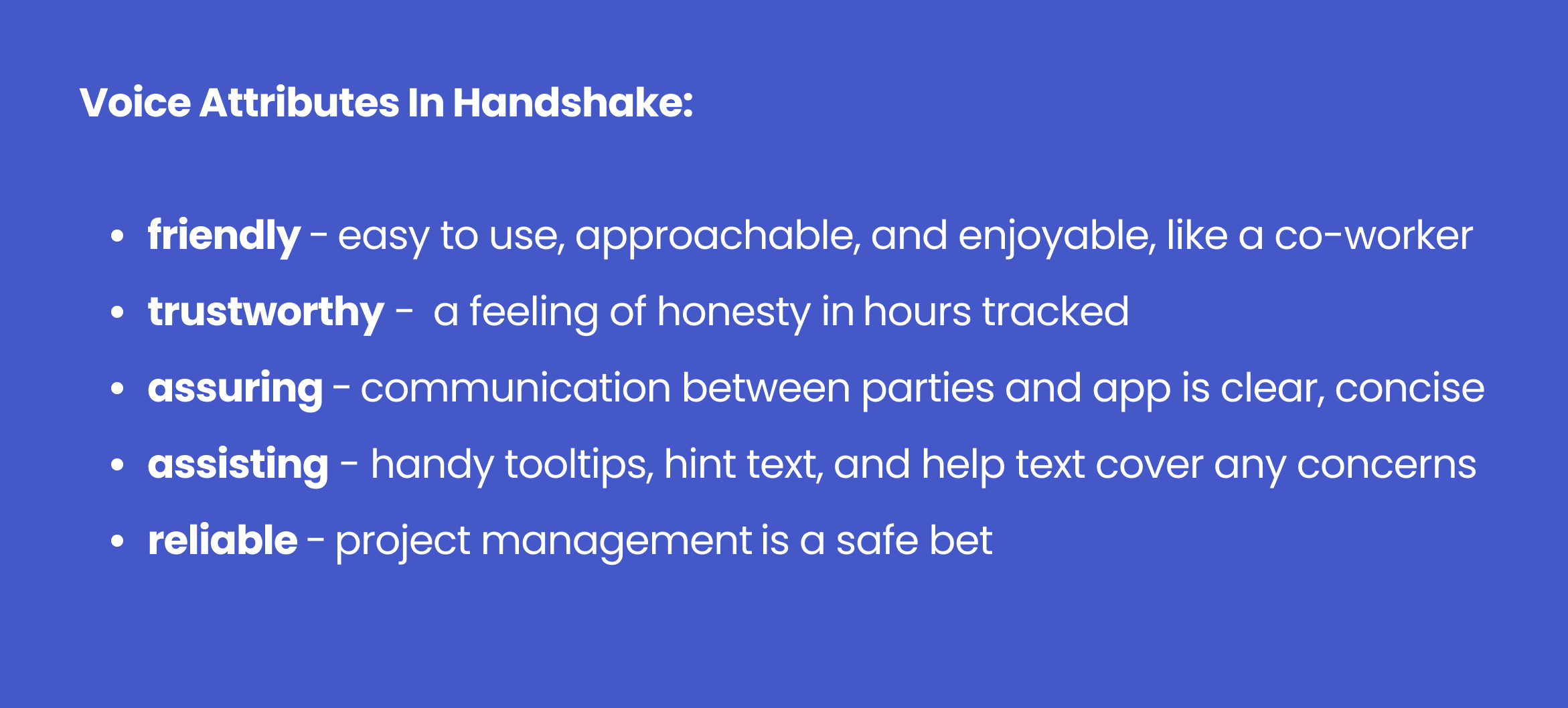
2) Create voice attributes based on the empathetic response to the user
Next was to create voice attributes that answer the call to the user’s needs.
Developing Content Style
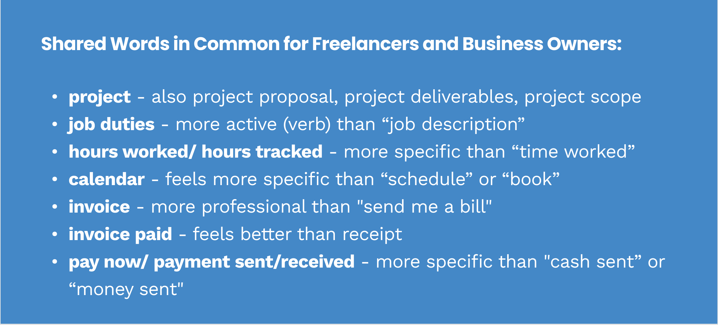
3) Speak the same language
As a starting point, I brainstormed all the words that both freelancers and business owners would use in order to find the common language from which to build the content style guide.
4) Building the Handshake Mini Style Guide:
The content style guide will be my reference for all ux writing in the user interface.
(click to enlarge)
Putting Voice, Tone & Style Together for Readability
5) Create consistent content patterns and parallel construction to reduce cognitive load
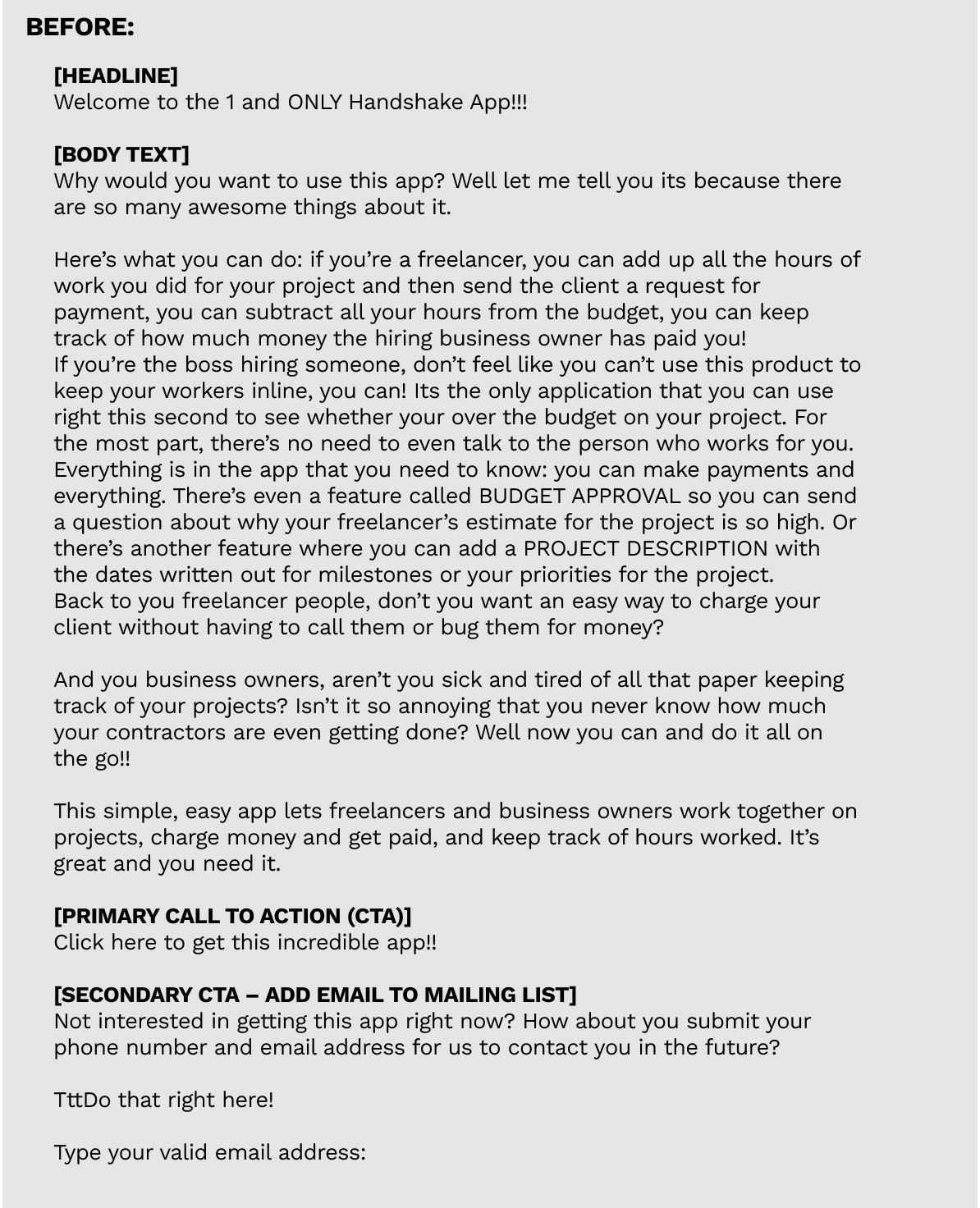
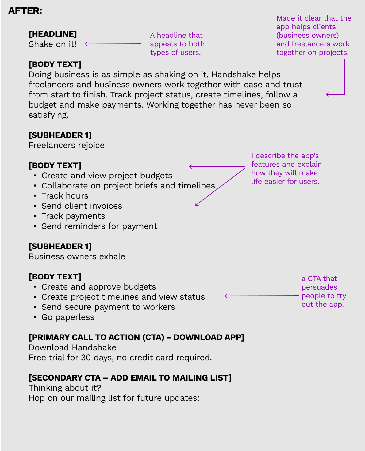
I edited the Handshake app landing page for clarity, tone, scanability, and a strong call to action.
Content Designing in Wireframes
Before & After Screens of user interface screens
The “after screens” show my suggested ux writing edits in orange and notes to the ux designer in purple.
1) Setup Screens: Business Owner & Freelancer
2) Onboarding for the Business Owner
3) Onboarding for a Freelancer
4) Business Owner Ongoing Use
5) Freelancer Ongoing Use
6) Setup Confirmation Screens and Additional Screens

Resulting Discovery:
UX Writing paired with the UX Design, and UI Design really does determine the quality of the user experience, the cognitive load, and the success of a product. Getting all three right is imperative. Every single word matters as does every single expression of tone of voice express the brand to the user.