Scholar's Digital Library
A Specialized Archive for Comparative Religious Study
UX DESIGN · INFORMATION ARCHITECTURE · MULTI-STAKEHOLDER
Role: UX Research · Information Architecture · Interaction Design · Wireframing · Stakeholder Management
Project Type: Commissioned client work — in active development Timeline: Multi-year engagement
Tools: Figma
Status: on hold for next round of funding
A stripped-down version of the Figma prototype is available to view. Full wireframes are private at the client's request.
The Project
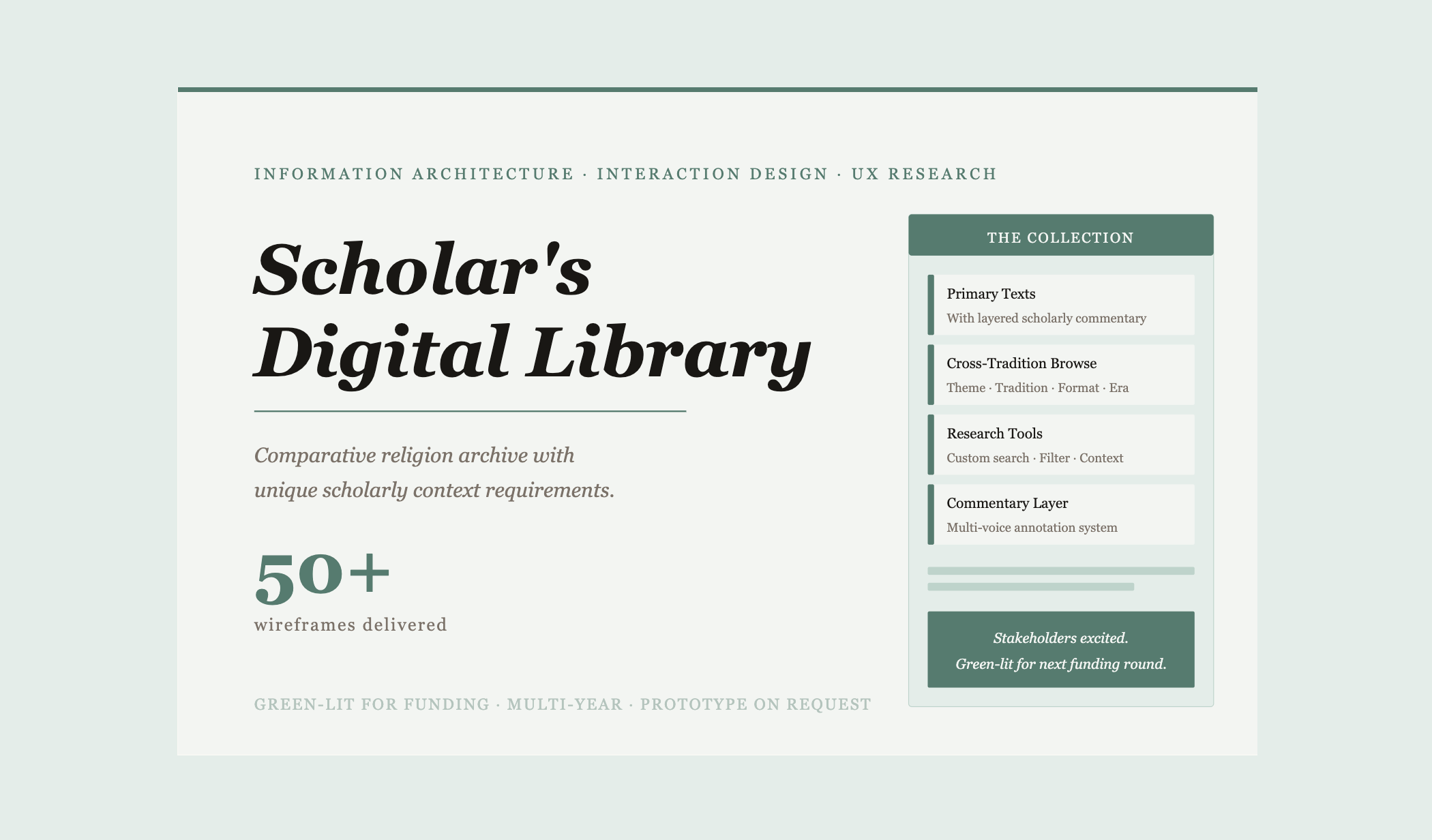
A private foundation is building a subscription-based digital library for the scholarly study of comparative religion — a curated, annotated collection spanning the world's major spiritual traditions, organized to support serious academic and contemplative research.
The collection is structured book by book, with each work carrying layered scholarly commentary, contextual framing, and cross-references to related texts across traditions.
No existing digital library platform provided the UI needed to hold that kind of complexity — the standard database-driven patterns weren't built for a collection where context, sequence, and commentary are as important as the primary texts themselves. I was brought in to lead the UX design from research through high-fidelity wireframes across a multi-year engagement.
The Challenge
Three distinct problems had to be solved simultaneously. The first was a content architecture problem. The library's organizational logic — books nested within collections, with multiple scholarly commentaries attached to each — required custom interaction patterns that didn't exist in standard library UX. Users needed to move fluidly between primary texts, contextual commentary, and cross-tradition connections without losing their place in the collection. The second was a stakeholder alignment problem.
The project involved multiple teams across disciplines — scholars, archivists, developers, and organizational leadership — each with strong domain expertise and differing ideas about how the library should function. Translating those perspectives into a coherent UX vision, and getting alignment across a distributed team, was as much the work as the design itself. The third was a scoping problem. The collection is large, nuanced, and growing. The IA needed to be flexible enough to accommodate expansion without requiring a redesign — a system built to scale, not just to launch.
The Work
began with market research and a competitive analysis of existing digital library platforms — evaluating how academic archives, digital humanities projects, and subscription library products handled complex, multi-layered collections. None of them fully solved the problem, which confirmed that custom interaction design was necessary rather than optional. From there I developed personas and user journeys for the library's primary audience segments: serious scholars, advanced students, and contemplative practitioners — each with distinct research behaviors, search patterns, and depth requirements.
With that foundation in place I built out user flows and key page architectures in Figma, working iteratively with the core team to develop and refine the unique interactive components the collection required — custom search and filter logic, commentary layering, collection navigation, and cross-reference linking. The wireframe work covered 50+ screens across the full platform: homepage, browse architecture, collection pages, individual work detail pages, commentary views, search results, and subscription access flows. All mid-to-high fidelity, with interaction notes and developer annotations embedded throughout. Stakeholder reviews were ongoing throughout — presenting work, incorporating scholarly feedback, and iterating on components that needed to meet both usability and domain-specific accuracy standards simultaneously.
Outcome
The wireframes were met with genuine enthusiasm in stakeholder review — not just approved but used as the vision document for the project's next phase of development. The project was subsequently green-lit for its next round of funding, with the UX prototype serving as a key part of that case. What made the difference wasn't just the design quality — it was the willingness to sit inside a genuinely complex domain, absorb substantial scholarly input, and translate it into interaction patterns that non-designers could immediately understand and respond to. The flexibility to iterate on complicated components without losing the overall system coherence was what kept the multi-year engagement on track.
Stripped-down prototype available to view · Full wireframes available on request · 50+ screens across platform